
Issue 02 · On the Wall · Posters & Advertising
Four Colours and What They Could Not Do
Almost every printed image you have ever seen is four inks pretending to be a spectrum, and the places where the pretence fails explain a lot about old print.
How the trick works
Cyan, magenta, yellow and black are printed as tiny dots at different angles. Your eye cannot resolve them at reading distance so it averages them into a continuous colour. It is a genuinely astonishing piece of engineering and it is about a hundred and forty years old.
The angles matter enormously. Set two screens at similar angles and the dot patterns interfere, producing a moire that looks like a watermark and cannot be removed after printing. The standard angle set exists to avoid this and is one of those pieces of trade knowledge that is completely invisible when it works.
The colours four inks cannot reach
The four-colour gamut is smaller than the range of colours that exist. It struggles most with saturated oranges, deep purple-blues, and any vivid green. It cannot do metallic anything, and it cannot do a true fluorescent.
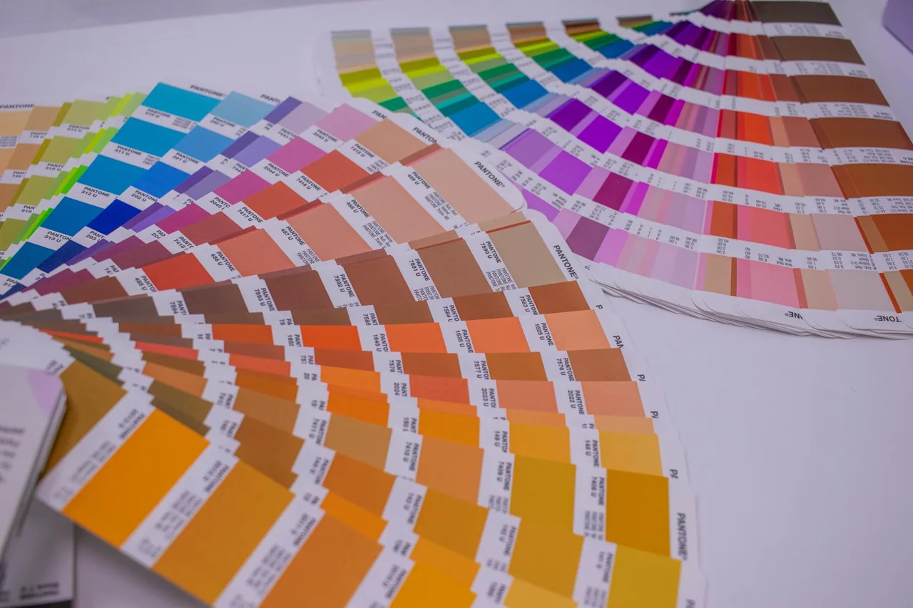
This is why so much period packaging and advertising used spot colours: a fifth ink, mixed to a specific shade, printed as a solid. British Racing Green and the specific reds of Italian marques are almost impossible in four-colour and trivial as a spot.
So when an old brochure has a colour that looks impossibly rich next to anything modern, that is usually what you are looking at, and the reason it is not done now is cost per press pass.

Registration and why misalignment ages well
Four passes means four opportunities for the sheet to sit a fraction out of position. Slight misregistration produces coloured fringing at the edges of shapes, most visible where black type crosses a colour.
In a modern job this is a fault. In period lithography it is part of what the work looks like, and reproductions that correct it perfectly often feel oddly dead, because the softness of hand registration was doing something for the image that nobody intended.
It is also the quickest way to tell a period print from a modern reprint: look at black type over colour under a loupe.
What this means for buying reprints
A good modern reprint of a four-colour period poster is a photographic copy of an object that was itself a compromise. Two generations of gamut loss are involved and the deep colours suffer most.
The best reproductions go back to the original artwork rather than to a printed copy where that artwork survives, and they will usually say so. Where it does not survive, a careful scan of a clean original is the honest alternative and there is nothing wrong with it.
What to avoid is a scan of a scan, which shows as a soft, slightly grey image with the dot rosette of the previous generation still visible inside the new one.
Duncan Ashby, March 2026
Next piece: Why Car Brochures Were Art-Directed Like Fashion Shoots