
Issue 02 · On the Wall · Posters & Advertising
The Golden Age of Motoring Poster Art
Between the wars the motor poster was the most advanced commercial art in Europe, and the reason was a printing constraint rather than a movement.
The constraint that made the style
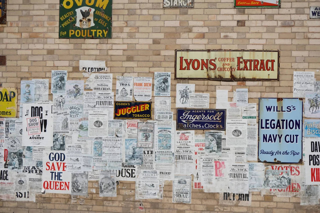
Stone lithography prints one flat colour per pass. Every additional colour is another stone, another registration, another run through the press and another chance to ruin the sheet. Printers charged accordingly and clients counted colours.
So the artists worked in three or four flats and got everything from composition. No gradients, no photographic detail, hard edges, enormous simplification. The look we now call art deco poster style is, at bottom, a set of workarounds for a press.
This is why it has aged so well. Work that is driven by a genuine constraint tends to look designed rather than decorated, and it does not date the way fashion-led work does.
The names worth knowing
Cassandre is the obvious one and deserves it: his railway and shipping posters solved perspective problems nobody else had noticed were problems. Geo Ham covered Le Mans and the Grand Prix circuits with a sense of speed that photography could not touch for another thirty years.
Guy Sabran, Rene Vincent and Roger Soubie all worked the French motoring accounts. In Britain the tradition ran through Shell and BP, who commissioned Graham Sutherland, Paul Nash and Ben Nicholson for what were, technically, petrol advertisements.
That last fact is worth sitting with. A fine artist of national standing painted a lorry bill for a fuel company, and the company put it up on the side of a vehicle.
What separates a good one from a decorative one
The strong posters have one idea. A curve, a diagonal, a single point of red. The weak ones have a car, a name, a date and a border, arranged politely, and there are a great many of those because most of what was printed was ordinary.
Reproductions have flattened this distinction, because a poster that fails at fifty feet can look perfectly nice at A2 on a wall. If you are buying for a room rather than for a collection, that is a legitimate position and worth being honest about.
For anyone furnishing a wall rather than building an archive, the useful survey is of vintage car posters worth framing rather than of the auction market, because the reproduction and licensed-reprint end of this is where almost all of the good design is actually accessible.
Original, reprint and reproduction
An original is a period lithograph printed for use. A reprint is a later run from the original stones or plates, sometimes authorised, sometimes decades later. A reproduction is a modern photographic copy, usually offset or digital.
The price gap between the three is enormous and the visual gap at normal viewing distance is small. Under a loupe an original shows the grain of the stone and the slight misregistration of hand printing; a modern reproduction shows a rosette dot pattern.
None of this makes reproductions dishonest. It makes them a different object, and the only real problem is when one is sold as another. the V&A poster collection is the best free reference for comparing what the originals actually looked like.
Duncan Ashby, February 2026
Next piece: Three Seconds at Eighty Miles an Hour