
Issue 02 · On the Wall · Posters & Advertising
Three Seconds at Eighty Miles an Hour
Roadside advertising had to be legible to someone travelling past it, and that single requirement produced most of the design rules we still use.
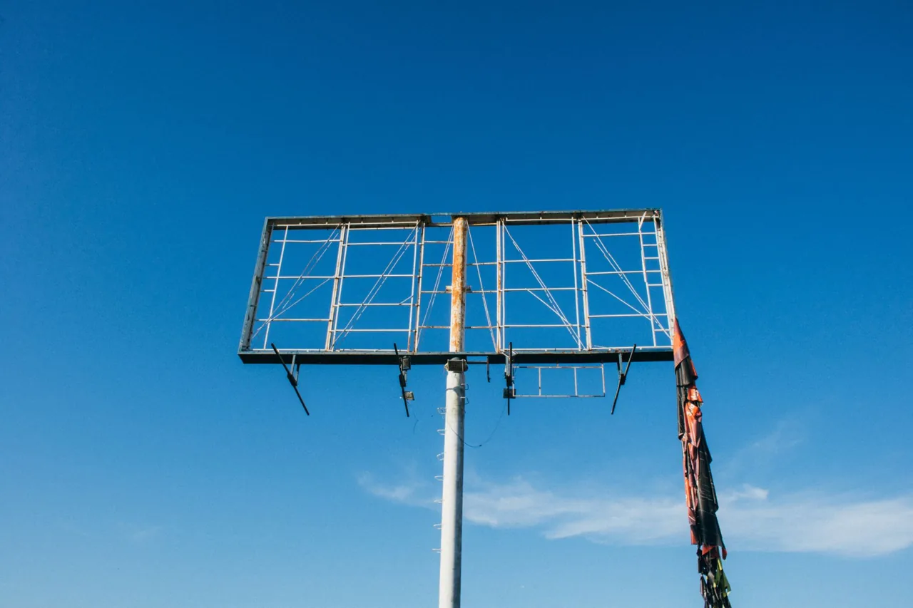
The brief is a duration, not a size
A hoarding is not read, it is glimpsed. At forty miles an hour a driver has perhaps three seconds of usable attention on a board, and at motorway speeds considerably less. Everything about roadside design follows from that number.
Seven words is the traditional maximum, and it is not a stylistic preference. It is roughly what can be taken in and understood inside the available window while performing another task.
What legibility at distance actually requires
Contrast beats colour. A dark type on light ground or the reverse survives fog, rain, dusk and dirty glass; two mid-tone colours of similar value do not, however pleasant they look on a desk.
Weight beats size. A heavier letterform at a given height reads further than a lighter one at the same height, which is why hoarding type is so often condensed and bold rather than simply large.
And letterspacing matters more than anything designers usually give it credit for. Tight setting closes up at distance into a grey block. The old sign painters opened everything out, and their work is more readable than a great deal of modern outdoor advertising.
The single-idea rule
The strongest roadside work has one image and one line, and the two do different jobs rather than repeating each other. If the picture says it, the words should not say it again.
This was well understood by the 1930s and has to be relearned by every generation. The failure mode is always the same: a client adds a second message, then a phone number, then a logo at a size that satisfies the boardroom, and the board becomes unreadable at the only distance it will ever be seen from.
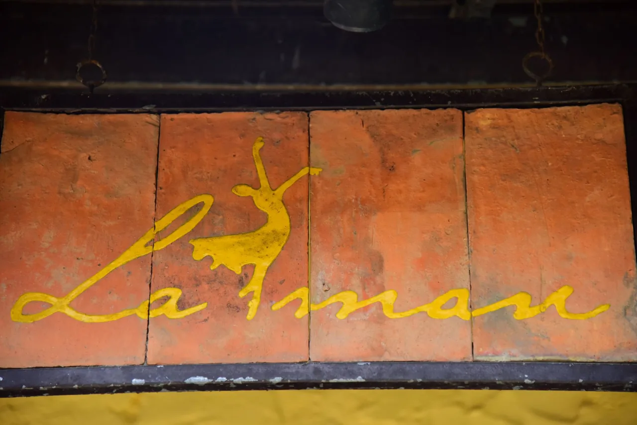
Why the old boards look better
Hand-painted hoardings had to be drawn at scale by someone standing on a gantry, which imposed a discipline. Complexity cost days of labour and every element had to justify itself.
Printed and now digital boards removed that cost, and detail became free. Free detail is the enemy of three-second legibility, and it is why a 1938 petrol advertisement is often clearer than a 2024 one for the same product.
The archive material at the National Archives includes a surprising amount of roadside and transport advertising, and it is free to search.
Duncan Ashby, March 2026
Next piece: Four Colours and What They Could Not Do